The accepted formula for a website design is a white background, black or dark grey text and brand colouring sprinkled liberally throughout. The vast majority of top performing websites use this formula to great effect. But is it the only formula that can be successful? In this article, we're going to dig deeply in creating a design with a dark background - and why sometimes it's better to use this concept, because, sometimes websites with dark backgrounds can outperform white.
Fire up a WordPress theme, SquareSpace, Webflow, Weebly or one of the many other web design tools and it will automatically load a page with white background with black text. You can change it of course, but this combination is the perceived norm.
It doesn’t have to be.
When done right, a dark background for a website can work better than you might think.
The first concern of any web design is what does the user want? What colours suit the medium, the brand, the intended use, the target audience and what would work on the devices being used to access the site?
Most clients assume that will be a white background with black or dark sans serif fonts. That assumption may not be so black and white (pun intended).
Why white?
There are two primary reasons why the combination of black on white is regarded as the norm.
But this is actually rooted in history: Print and readability.
Back when we did everything on paper, the off-white colour of paper meant it was easier to use black for ink rather than colour the paper. You needed less dye and it was a much cleaner and easier job. Those first printed pamphlets were black ink on light paper and print media stayed that way.
The other reason is readability. For many users, especially those on mobile, white on dark doesn’t always read well. Those with visual impairments like astigmatism have difficulty discerning white text on a dark background. Anything that makes the pupil expand like a dark screen does means the impairment is amplified, making a page very difficult to read.
However, great design can overcome these shortcomings and can make an impact, convey emotion and influence the visitor in ways a white background simply cannot.
What you need to know about dark backgrounds
I say dark a lot here and not black.
Black is the obvious choice for a dark background for a website but it isn’t your only option. There are thousands of variants of dark backgrounds and black is only one of them. Dark red, dark green, dark blue and others can all work with the right design in the right situation.
There are many aspects to colour use in design and I won’t labour the point with all of them here. I’m just going to concentrate on those aspects that pertain to dark backgrounds.
Visual perception of dark
A much-cited poll run by ProBlogger back in 2009 showed us that web users aren’t as in favour of white backgrounds as we might initially think.
Although ten years old now, the poll found just 47% of respondents preferred always light backgrounds. A further 36% said it depends on the blog, 10% said they preferred always dark and 7% couldn’t decide. The majority may prefer a white background, but 43% said they liked dark or it should depend on the overall site design.

A further poll four years later over at CSS-Tricks found that the majority of respondents actually preferred light text on a dark background. To be clear, this was a poll around using coding tools and asked what configuration the users preferred their code editors, dark on white or white on dark. Of those who responded, 63% of them preferred a dark background.

The contrast aspect
The snappily-titled 'The Impact of Web Page Text-Background Color Combinations on Readability, Retention, Aesthetics, and Behavioral Intention' is an interesting study.
It looked at how the contrast between background and text colours within a web design was the deciding factor in its usability and not the colours used. We’re not talking about aesthetics here, purely usability.

The study found that polarisation influenced readability more than the actual colour of the background. So white on black is just as effective as black on white as long as there was enough contrast between the two colours, readability, legibility and ease of use is maintained.
Contrast is incredibly important in web design.
Some modern websites try to use low contrast designs with mixed results. Even Apple have tried it with some pages on their own website.
Low contrast pages are harder to read, don’t work for the visually impaired and require more effort from the reader to make sense of it. None of that makes for good page design.
This goes against the contrast aspect and it’s the reader that suffers. To my mind, it doesn’t matter than much whether you use dark on light or light on dark as long as the contrast ratio is as wide as it can go to help readability.
The readability aspect
Dark backgrounds can be the perfect design choice in some situations.
Text-heavy websites are not one of those situations. While contrast has a larger influence over how legible a page is, the colour choice also has an influence. According to Jacob Nielsen, negative text, that of white text on dark backgrounds, take slightly more effort to read and are read slower than positive text which is black on white background.
Aside from that, as long as the contrast between the text and the background is sufficient, readability is not impacted.

I would add a little to that. By saying white text on dark backgrounds do not impact readability as long as you design it right.
To me that means:
- Intelligent use of empty space between blocks to prevent light leakage.
- Proper readability rules are followed in terms of short sentences, short paragraphs, short words and easily digestible copy.
- Careful font selection to maximise legibility on different screen sizes.
- Maintaining maximum contrast when working with dark backgrounds.
- Avoiding gradients and shading with a dark background.
Font choice is important in any web design but even more so when dealing with dark backgrounds.
We usually select serif fonts because they add a touch of class or elegance to a design and use sans serif for modernity. When dealing with light text on a dark background, the choice narrows to sans serif only.
Serif fonts can work but require more work from the reader in order to understand. That is exacerbated when using smaller screens or mobile.
The emotional perception aspect
We all know that different colours can evoke different emotions. We have known this for years and more recent studies have backed that up with evidence. We know that different colour combinations affect the brain in different ways and some marketers think that colour use alone can increase conversion.
Colour psychology tells us that as we see colours, our brain signals the release of hormones which can make us feel emotion. Different colours cause different hormones to be released which can influence how we feel about something of a particular colour. This combines with our perception of what a colour means which can be used against us for marketing and selling.
We have ingrained ideas about what a colour means.
For example, black is often associated as a powerful colour, erotic, mysterious, formal and elegant. White feels clean, fresh, modern, young, accessible and familiar. Red is bold, powerful, confident and sensual.
Each colour invokes different feelings in the reader which is why, as web designers we spend such an inordinate amount of time trying to come up with the perfect combination and then even longer trying to convince the client the colours we chose will work.
Benefits of dark backgrounds

Dark backgrounds are not suitable for every design or project.
When they are suitable, a dark background can add character, impact, emphasis and some emotional response to a web design. I have covered all that already so let’s look at some other benefits of using dark backgrounds in design.
1. Less eye strain
Apparently it is easier to read for longer when a dark background is used. Even though we read slower, as long as that contrast ratio is wide enough and the design is otherwise sound, we can read without eye strain for longer periods of time.
On the subject of eyes, dark backgrounds will impact sleep less too. The screen will contain less blue/white light than a traditional web page. This blue light is now widely thought to impact our circadian rhythm and affect our sleep, cause illness and negatively impact our daily lives.
2. Stylish
There’s a reason why every woman has a little black dress or why limos are black. It adds a sense of style and elegance that is hard to get elsewhere. As long as the overall design is of a high quality, using dark backgrounds imparts that feeling right away which can influence a buying decision, create an emotional link or make the reader take what they see more seriously.
3. Familiarity
Websites with dark backgrounds used to be very rare. Those we did see often didn’t follow the usability rules at all and did not perform well. With more program UIs using dark backgrounds, games increasingly using dark backgrounds in menus, navigation and cutscenes and night mode in all kinds of devices, the dark is no longer so niche.
We see it everywhere. From many Adobe products, Windows 10 Dark Mode, Mac OS Dark Mode, Adobe Photoshop and Dreamweaver and many other leading programs.
Now we are more used to seeing light text on dark backgrounds, it doesn’t surprise or impact our expectations negatively in the way it once did.
4. Stands out
While websites with dark backgrounds are becoming more acceptable, they are still in the minority. This provides an element of impact immediately someone lands on the page. Even before a word is read or image scanned, your page is already making an impression and causing the reader to look with fresh eyes at the design.
As long as that design builds on that initial first impression with good readability, good use of space and some impactful imagery, you’re onto a winner.
5. Fades into the background
Dark UIs and backgrounds provide that initial first impact but then can fade quietly into the background to let the content shine. This is more true in UI design but has relevance in web design too. Carefully placed images and content with the right level of contrast will then stand out a lot more while the background itself recedes from view.
This can help read page content in bright environments such as outdoors or under strong light. In darker environments, a white or light background can strain the eyes and be difficult to read. In lighter environments, a dark background can be the opposite. While we cannot design for specific environments, it is nevertheless a benefit of a darker background that it reads well in sunlight.

Downsides of using dark backgrounds
Using a dark background in design isn’t universally positive. There are some downsides to this style and they should not be underestimated.
1. Careful consideration
Dark backgrounds won’t work for every client or every situation. This design theme requires much more thought and planning than the traditional light background does. It will also require more user testing to make sure the balance is right before launch. Not all brand schemes will work with dark backgrounds. Not all products or subjects will work with it either.
Some clients still perceive dark backgrounds the way we used to, negatively. Even if you’re convinced a dark background is the way to go, you may have a harder time convincing your client than you would if you were going the traditional route.
2. Careful planning
All design choices require careful planning, colour, font and image choice. Using dark backgrounds adds even more thought to that. White/dark space becomes even more important to stop light bleeding into the dark and to ensure text is readable. Images and design elements need real separation to keep them legible and to stop leaking light or colour into other areas.
The development process may take longer with a dark background because of this. More user testing may be required and more refinements to the mobile experience may also need to be factored in.
3. Careful balance
Using dark elements within a design adds weight to a page. Too much weight and the page can feel cumbersome and heavy. That is even more true when dealing with dark backgrounds. Each page needs to be balanced very carefully to stop it feeling heavy and to bring out its inherent elegance rather than ungainliness.
It’s a tough ask and will require a lot of refining and a lot of white/black space on the page to keep it balanced.
4. Accessibility
One aspect of dark designs that doesn’t get much attention is accessibility. Every web design should have accessibility in mind at the very earliest stages of planning. Fortunately, as long as you follow the general rules on high contrast between text and background, the majority of users will be able to read and understand your page.
The Web Content Accessibility Guidelines (WCAG) requires a 4.5.1 colour contrast between text and background for normal text and 3:1 for large text. It suggests white text for black backgrounds but there is some leeway there for other colours as long as the contrast ratio remains as wide as possible.
I mentioned astigmatism earlier as this is one impairment that is negatively affected by using dark backgrounds. Astigmatism is an imperfection in the cornea that causes blurred or distorted vision. On a dark background, the pupil has to dilate to read, which accentuates the blurriness.
While this is just one impairment in a world of many, around 33% of Americans have some form of astigmatism. If you expand that to a global audience, almost a third of your potential audience may have astigmatism to one degree or another. That is something every design needs to take into account.

When you should use a dark background
There are a range of situations when dark backgrounds lend themselves well to web design. They include:
- When you want to make that initial visual impact.
- When dark fits the client’s brand identity.
- When showcasing luxury or high status products or services.
- When the design is modern or minimalist.
- When you need to create drama or mystery in a design.
When you shouldn’t use a dark background
Equally there are times with a dark background won’t be your best option and should be avoided at all costs. Even if the client insists on using one.
- When the page is content heavy.
- When the brand voice doesn’t support it.
- When the target audience is known to not respond well to it.
- When there is a lot going on with the page and white/black space is at a premium.
- When the intent is B2B or official, such as governmental.
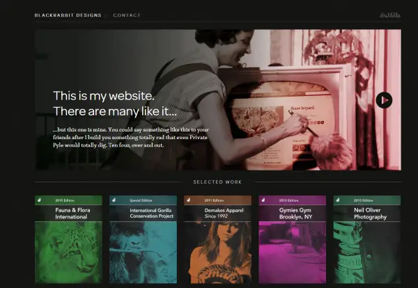
10 Examples of dark background themes
To show you what I mean about dark backgrounds looking amazing when done right, I have collected ten excellent themes that use them. Each is slightly different in terms of design but all have one thing in common, they use dark backgrounds to maximum effect.
1. Divi with Web Freelancers Layout Pack
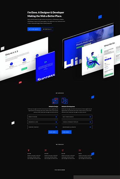
The Divi WordPress theme has to be one of the most flexible around. While many of its templates are light background, you can reverse it in seconds. Add the Web Freelancers Layout Pack to Divi and you can have a superb website with a dark background for any use.
All you need to do is install the two themes, activate the theme, open a page and switch backgrounds to dark. Then use the ‘Extend Background Colour’ option on page sections to bring everything into line.
Get Divi at 10% off until July 2026
2. Astra with Photographer Starter Site

Using the Astra framework with the Photographer demo site install delivers an excellent website with a black background. Good use of space, contrasting fonts and minimalist design makes this theme stand out.
Check out the Photography Starter Site
3. Genesis with Parallax Pro

Parallax Pro is a theme for the Genesis framework that uses an alternating monochrome design to great effect. It’s another simple design that lets the page content shine and provides an excellent example of how dark backgrounds can work so well.
4. Lens From PixelGrade
![]()
Lens From PixelGrade uses a grid design to give us a portfolio or image showcase using a dark theme. The dark background is only really visible in the side menu and the theme uses contrasting colours in a very interesting way, adding colours other than black and white to really stand out.
NB: We have a 20% OFF directly from PixelGrade, exclusive to CollectiveRay visitors. Just click on the link below, your discount will be automatically applied when you check out. This offer is valid ONLY until the end of July 2026.
5. Divi with Electrician Dark Pack

Another Divi theme, this time the Electrician Landing Page in dark. This is a very high quality theme with dark background, sharp typography, good use of imagery and some complementing colours to add interest. This one is a personal favourite and I think it works amazingly well.
6. Aldo from ThemeRex

Aldo from ThemeRex is a theme that makes elegant look easy. It’s an effortless theme that would work for many subjects and balances lots of page content with a dark background without overloading the page. It’s a very accomplished design that works well on any screen size.
7. Neve Pro with Dark Parallax Images

Neve Pro with Dark Parallax Images uses the Neve theme with all its power, speed and features. Combined with a dark background and complementing theming, this WordPress theme is one of the best out there. Pages are balanced well, it loads quickly, the content guides the reader smoothly down the page and you are left wanting for nothing.
8. Telling with Gamer Layout

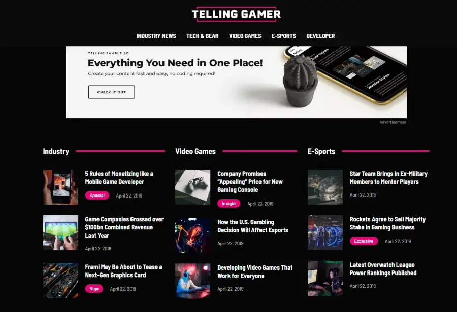
The Telling with Gamer Layout is an excellent example of how to use other bold colours to enrich a dark background. Don’t be fooled by the gamer moniker, you could use this theme for anything and it would still look amazing. A strong menu, excellent layout, superb sharpness and contrast and good use of space are just a few of the positives.
9. Nextout
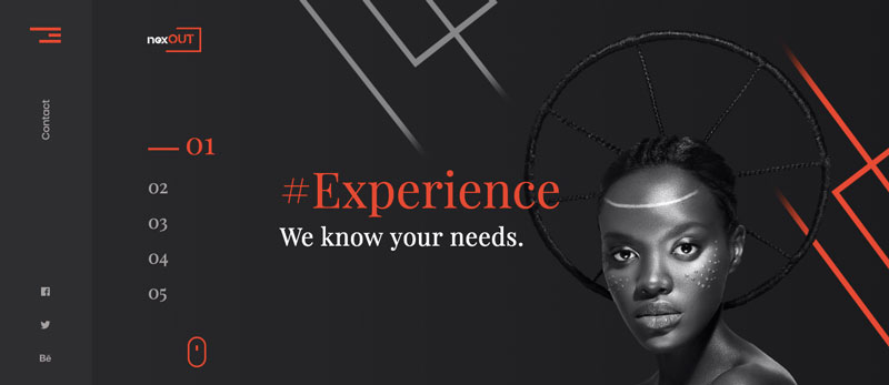
Nextout is a very stylish WordPress theme that uses a lighter dark background with contrasting and complementing colours. With an attractive top slider, you scroll down into a tiled layout that would lend itself perfectly for image-oriented websites. With slick navigation and well-considered layouts, it is definitely one of the better web themes here.
10. Hestia Pro with Dark Parallax Images

Hestia Pro with Dark Parallax Images is another very slick theme that balances dark backgrounds with light elements, contrasting colours and excellent typography. Pages are rich but not overfull and the balance is just right whatever type of screen you use. It could work on any device, for any subject matter and is definitely one to try.
If you want to learn more about Hestia - check out this article on Collectiveray.
Conclusion: Using dark backgrounds in web design
One of the best things about the modern internet is the freedom to express yourself and break the rules. While some of those rules absolutely should not be broken, some can. Such as the traditional black on white design that has been with us since the 17th century.
I think dark backgrounds can look amazing when done with a careful eye. They make that initial impact and then fade into the background. They work well in most light conditions and a well balanced page with clever use of space can make that background emphasize the product or intent of a page better than white backgrounds.
Dark designs don’t suit every project or every intent and requires much more planning, refinement and testing than white backgrounds. However, done well, I think all that extra time and effort can be well worth it!