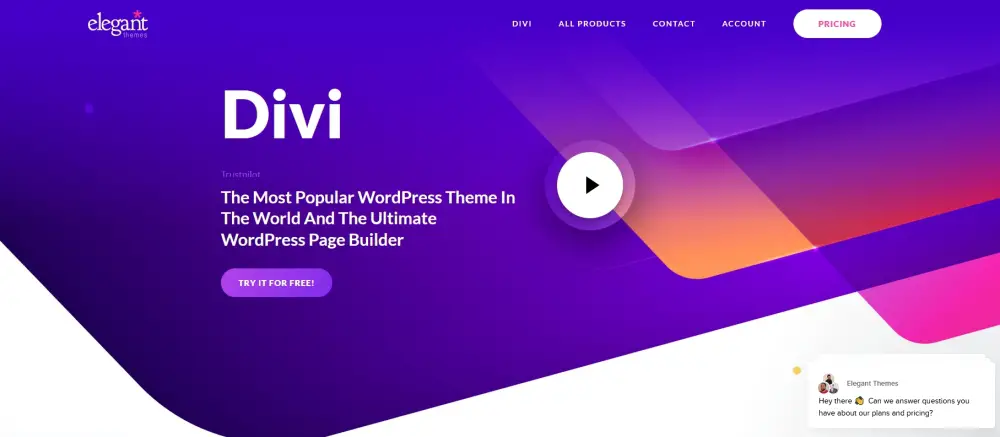
The Divi theme by Elegant Themes is one of the most influential products on the market. Which is why people look for Divi theme examples in live projects, so that they can see what the results can be like!
Designed to deliver a total web design experience to people of all skill levels, not just web designers, the Divi WordPress theme is easy to use, yet incredibly powerful.
That’s a winning combination, no wonder that Divi is the most popular WordPress theme out there!
With continual updates to make it faster and easier to work with, Divi is kept current and kept popular. All the more reason to try it.
If you’re still on the fence about the Divi theme or are wondering if it’s worth the investment, this post should help.
Rather than write the usual Divi review, we’re going to showcase some of the best Divi WordPress themes available right now and how they appear on real life websites.
Each is available with the premium version while some will be available with the free version too.
All make an excellent template for you to use on your next project.
{autotoc}
What is Divi?
Divi is both a WordPress theme and a drag and drop page builder. And Divi 5 is in development!
The Divi WordPress theme can be used on its own as a standalone theme and be customized in the usual ways.
Elegant Themes created the Divi WordPress Theme Builder as a drag and drop builder along the lines of Elementor, Beaver Builder and others.
The theme builder was introduced in more recent version of the Divi theme and opens up a whole new world of web design.
With 200+ page templates on the Divi website and lots of features, few other WordPress templates come close in terms of quality and features.
That’s why we like it so much!
Click below to get a great discount on the Divi theme directly from the Divi website.
Click here to get Divi at 10% OFF in April 2026 only
Divi themes
Rather than just dump a list of amazing websites and Divi themes onto one page, we’re going to order them logically using categories.
Even if you already have your own Divi website, these examples by niche will surely help for your next project.
Those categories will include:
- Business themes built with Divi
- eCommerce themes built with Divi
- Blog themes built with Divi
- Portfolio themes built with Divi
- Food business themes built with Divi
We think this will cover the best Divi theme examples you can find, websites created using Divi layouts or Divi child themes, while keeping the list manageable.
Let’s get started!
Business themes built with Divi
Business themes have a lot of work to do. They need to portray your brand, build trust and deliver the experience visitors look for.
The following popular Divi theme examples deliver that. We think Elegant Themes has outdone themselves here!
Each of these Divi sites works well on desktop or your mobile device, which is a key consideration for business.
Fern Colab
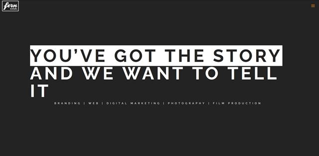 As a design agency, Fern Colab managed to get the most out of Divi with their website. It’s modern, engaging and offers a different experience from cookie-cutter websites.
It’s exactly the kind of creativity and innovation you would want your creative agency to display, which this website clearly shows.
The Divi Agency Portolio Page template would make a great foundation for a similar design.
Chasing Mumford
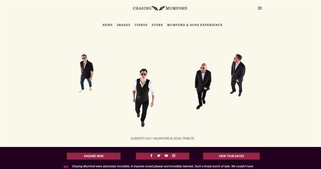 Chasing Mumford is a website dedicated to the band Mumford and Sons. It’s a creative website with plenty of space for a full screen background image and content to shine and for your eyes to relax.
It’s a very well designed theme that’s light with dark areas and portrays the same relaxed vibe as the band. It’s a minimal design but still managed to pack a punch, which is why we like it so much.
You could easily use Elegant Themes’ Divi Meetup Landing Page to create something similar for yourself.
Timeline Missions
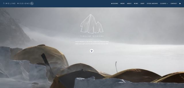
A video background either really works or really doesn’t. Fortunately, in this case, it really works. Embedded videos are the way to go these days!
The theme is for another creative agency that has managed to showcase itself in creative ways. They have used parallax scrolling in one of the best ways we have seen to deliver a genuinely interesting one page website.
The combination of bright colours, shading and small fonts work incredibly well too.
The Divi Travel Agency Home Page could help you mimic this look with very little effort.
Bookin Agency
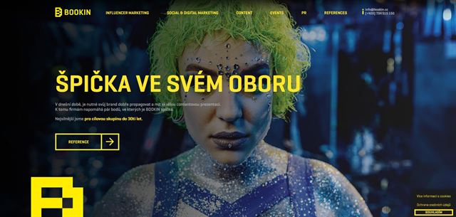 Bookin are a Czech marketing agency so they are another organization you fully expect to deliver an excellent website experience. They don’t disappoint.
It’s an impactful design that isn’t afraid to grab your attention and never let go. It’s a dark theme with bright fonts, incredible images and some nice touches throughout to soften that initial impact.
This is another design where the Divi Agency Portfolio Page could help.
The Generation
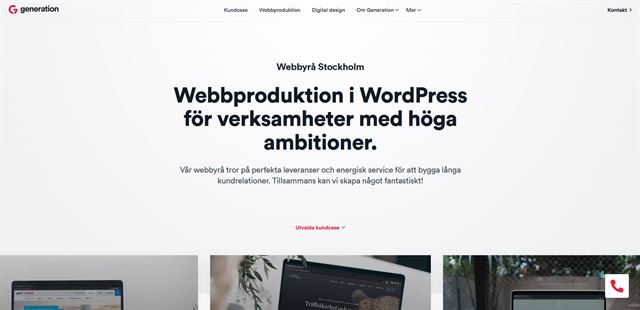 The Generation exhibits something the Swedish are masters of, minimalism. It’s a simple design with impactful elements, lots of empty space and a bold contrast colour to add interest.
Some great spacing and home page layout combines with strong images to showcase this creative brand.
If you were looking for someone to handle your creative needs, wouldn’t this website give you confidence you found the right team? We certainly think so!
The Divi Boutique Landing Page could help you achieve something very similar.
KeyShot
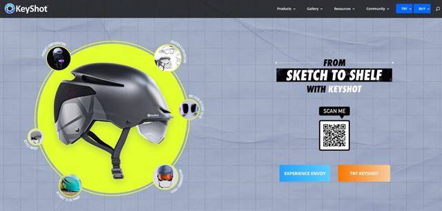
KeyShot is commercial 3D rendering software so it needs to be showcased in the best possible way. This website delivers on that.
This is a colourful website with bands of rich colour and plain colours for separation and to rest the eyes. It’s a well balanced look with nice font choices, simple shadow effects and a clear, unambiguous appeal.
The Elegant Themes’ Divi Pottery Studio Landing Page layout has a similar feel that could be customized to suit.
Nomad Capitalist
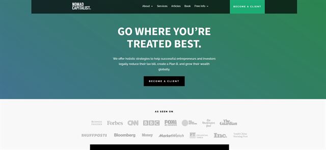
Nomad Capitalist is a financial services company that enables entrepreneurs to travel while minimizing their tax burden. It’s all legal and above board but has a more relaxed approach than typical financial websites.
It uses a green colour for trust, plus bands of colour and white to differentiate sections. It’s a simple design that tells the story as the home page unfolds and is very creative.
The Divi Copywriter Landing Page could help you achieve a similar look with a little work.
Southern Bankcorp
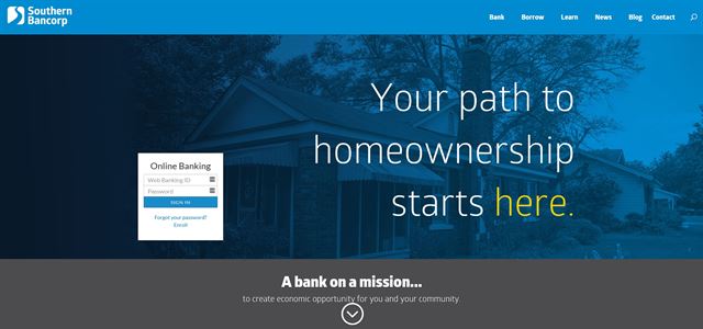
Southern Bankcorp is a small bank that offers home loans to people in Arkansas, US. It’s a simple design that conveys a country charm ideal for the local market, without compromising the authority or reassurance we expect from a financial institution.
The theme uses blocks to separate sections and keep things ordered, which is a simple but very effective layout format.
You could so the same for your company by using Divi Elementary School Landing Page.
Conversion Lab
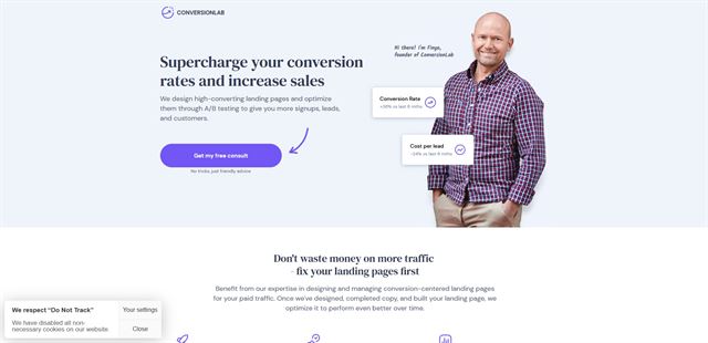
Conversion Lab is a small website optimization company that provides small business services to other startups and small organizations. To appeal to that market, it has to appear professional and approachable at the same time.
We think Conversion Lab delivers that with this soft and approachable theme that is well designed and has a friendly feel we can relate to. The CTA to the contact form is also nice and prominent, such that one can provide their contact details immediately and convert!
The Divi Business Coach Landing Page template has a very similar look and feel. So if you plan to create a landing page website, you should definetely check it out.
Buffer Insurnace

Buffer Insurnance is an insurnace firm based in Texas, US. It’s another friendly approachable web design that conveys professionalism while still being approachable.
The use of white, blue and breight colors is used to convey trust while lots of space and pops of other colours keeps interest high. It’s an effective design that really works.
The Divi Accountant Landing Page would require very little work to deliver a very similar feel.
Divemaster Gilis
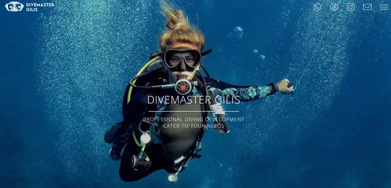
Divemaster Gilis is a fullscreen layout with an engaging image showing a diver in rich blue water. It’s the perfect opening for a website for diving and we couldn’t have done better ourselves.
The rest of the site opens up into a light design with white background, lots of whitespace, modern sans serif fonts and plenty of information on the who, what, when and where of the diving school.
The Crytpocurrency landing page has a similar look and feel.
Bobcares
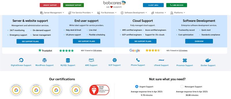
Bobcares is a small business website that offers IT services to other small businesses. It doesn’t use a typical layout but it makes it immediately apparent what’s on offer.
It’s a busy page but there’s enough whitespace to be able to understand everything. The use of blue, grey and white creates a calm atmosphere while the red and green CTA buttons stand out for all the right reasons.
The Mobile App Landing Page could deliver a similar, but more up to date look.
AboutSSL
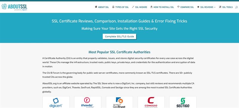
AboutSSL is an information website on the subject of SSL certificates. It’s a simple site with minimal design but still manages to be welcoming and easy to digest. It’s a great example of where minimal graphics work.
The use of calm blue and white evoke a similar feeling to Bobcares, with the reassurance of more modern fonts and trust markers to build authority.
We would use the Startup Landing Page to create a similar type of website.
BlogPasCher.com
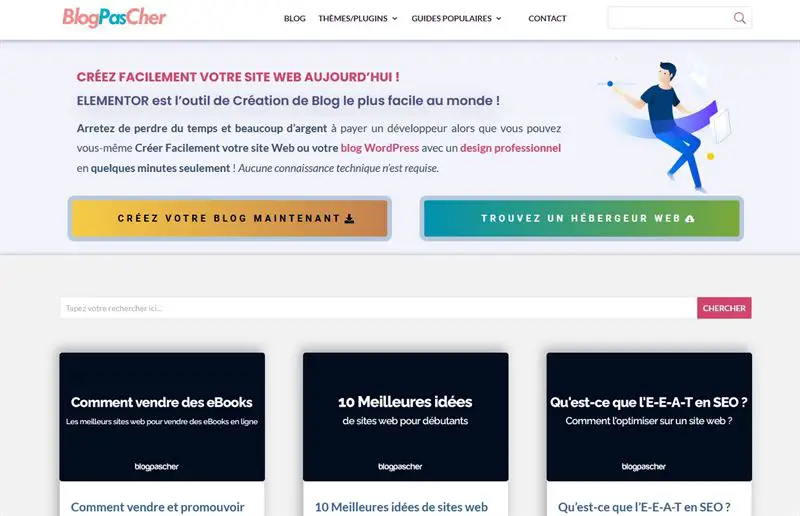
BlogPasCher.com is proof that Divi can work on non-English themes too. This site is in French, which has similarities to English in terms of word use but looks and feels completely different.
We have another design here with calm colours, simple graphics and a nice layout where visitors can find what they are looking for quickly.
The Interpreter Landing Page has a similar graphical look to this blog.
NPDigital
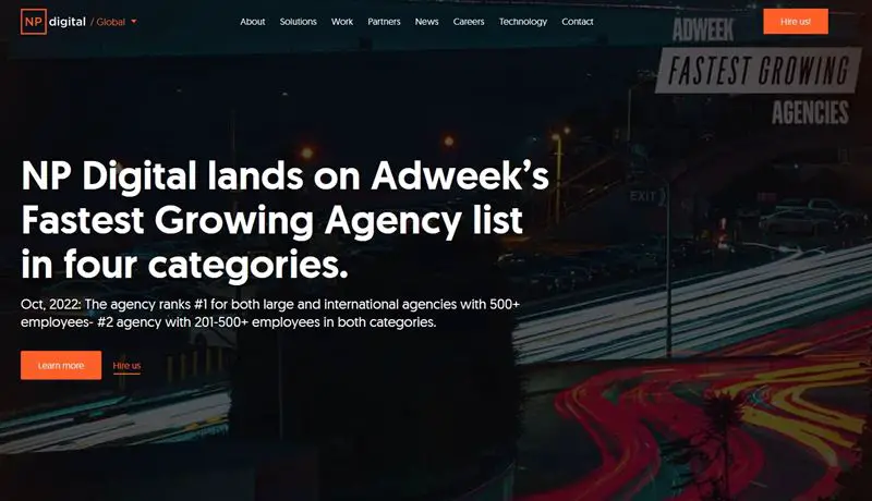
NPDigital is a marketing agency with a global presence. Their website uses Divi and strong dark and orange colours with a fullscreen slideshow to create engagement.
Below the fold, the site opens into a lighter design with grey and white while retaining the bold orange. It’s a nice design with simple messaging and minimal distractions.
We would recommend tweaking the Event Venue Landing Page for a site like this.
Astuces Divi
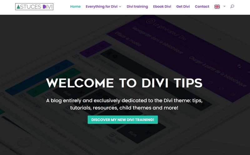
Astuces Divi is actually a blog dedicated to providing tips and tricks to get more out of Divi. The site opens quite plainly and is a little underwhelming but as soon as you scroll below the fold, things get interesting.
The site showcases some of the capabilities of Divi while keeping its own design simple and accessible.
We think the Artificial Intelligence Landing Page could recreate this site nicely.
99RDP
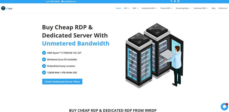
99RDP provides hosting and cloud services to businesses. It uses a light, easy going design with simple colours and graphics. It’s easy to read and digest, making it a pleasure to use.
This site may not be the best example of Divi in use but it’s easy to see that pages don’t have to be complex to work.
You could use the Digital Marketing Landing Page to build something similar.
Achirou
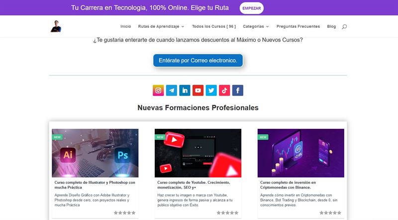
Achirou is a Spanish professional IT certification site that continues the simple design theme but a little more effectively. This site opens with a simple homepage with a course layout underneath.
The main colours are the top banner, CTA buttons and social network links. The rest of the interest is provided by course images, which works amazingly well.
The IT Services Landing Page is the obvious choice for a site like this.
Biznet Home
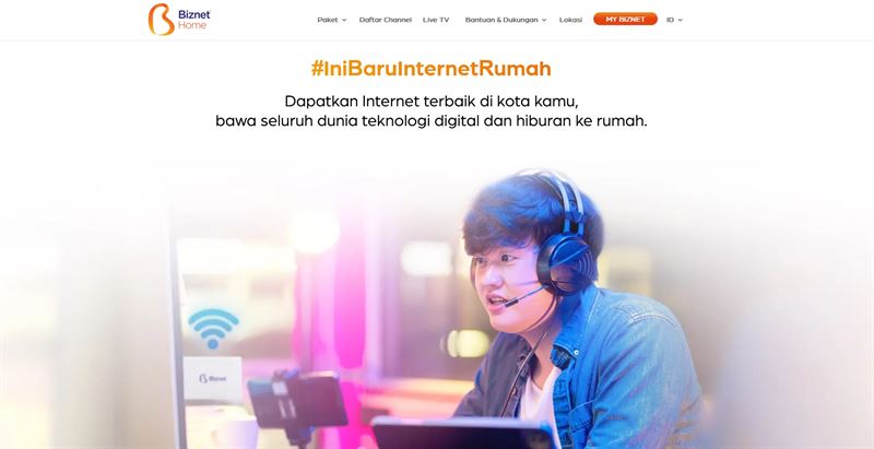
Biznet Home is a company offering WiFi solutions for the home in Indonesia. It uses a light, colourful design with a centred image and simple section dividers with images one side and content the other.
It’s a tried and tested formula that works well. White backgrounds, emotive images and a soft orange contrast colour creates a feeling of wellbeing, making you want to engage.
The Hosting Company Landing Page has this site type nailed.
Vida Mountain Resort and Spa
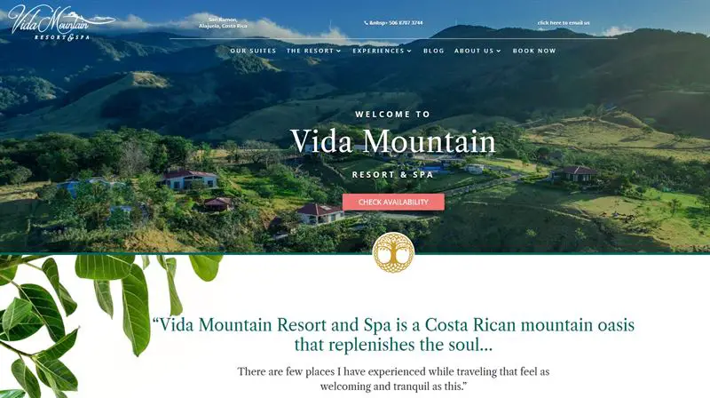
The Vida Mountain Resort and Spa evokes the feeling of luxury and tranquillity as soon as it opens. It’s an excellent example of a Divi theme that has been customized to suit its niche perfectly.
The combination of emotive image, calm colours, serif fonts and superb layout make the site a dream to use and welcomes you with open arms.
The Nutritionist Landing Page could do something similar with a little tweaking.
The Dungeon of Naheulbeuk
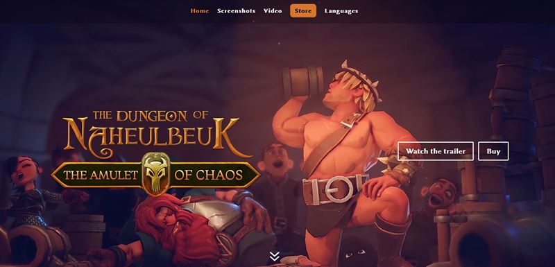
The Dungeon of Naheulbeuk is a website promoting a computer game. It uses a dark background and superb graphics and animations to hint at the game and encourage you to explore further.
The combination of imagery, orange stylized fonts and unfolding page scrolling provides a very professional look and feel.
The Video Game Landing Page is the obvious choice.
Mike’s Country Meats
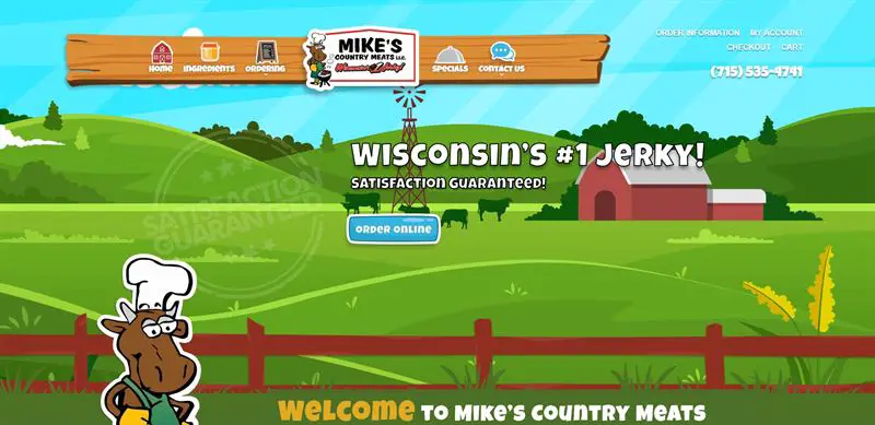
The Mike’s Country Meats is a bright, playful design with a cartoony feel. It’s a light hearted take on a food website and has bright colours, simple animations and clear messaging throughout.
The website design makes it easy to understand even though it uses custom fonts. The messages are clear and the path to purchase obvious to everyone, which is why this site works so well.
The Farmers Market Landing Page is the closest you’ll get without serious customization.
Wilkenwerk
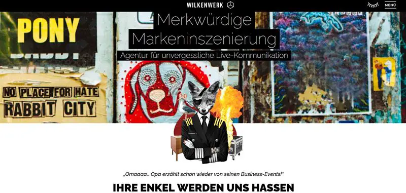
Wilkenwerk is a marketing agency based in Germany that uses Divi for its website. It’s an arty design with a definite edge, marking this site out as something to take notice of.
The design opens with a large fullscreen image with a dark banner before opening out into a more typical business website with service sections and a blog.
The Tarot Landing Page could be a match with some creativity.
EcoHost
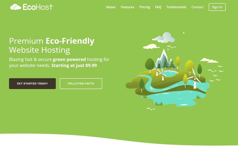
EcoHost is a web host with ecological credentials. It uses a simple design with lots of green and eco-style graphics to help tell the story, with business elements below the fold.
This site also uses the divi theme and makes a good job of evoking a feeling of calm authority, ideal for the niche. That’s one of the many reasons we like it.
Another easy one, Internet Service Provider Landing Page.
Male Health Scotland
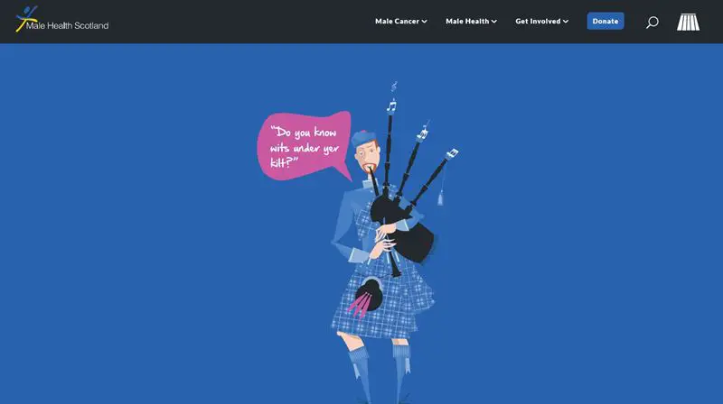
Male Health Scotland is exactly what the name implies. It’s a website promoting male health in Scotland. The messaging is clear and accessible, with simple colours, cartoon graphics and a simple layout.
There are some parallax effects throughout, with a colour palette that matches the Scottish flag. It’s a simple site done very well and should hopefully encourage engagement from the target audience.
The Telehealth Landing Page has a similar feel and could work well here.
Monterey Premier
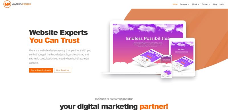
Monterey Premier are a web design agency that uses Divi for their own site. If that’s true, it’s a great design with an energetic orange and white colour scheme with lots of whitespace.
The page opens with a minimal but effective banner before opening up to service sections, a call to action banner and reviews. Its simple design done well!
The SEO Agency Landing Page could make a solid update to this page.
WordStream
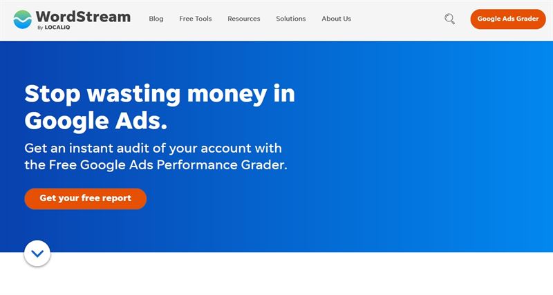
WordStream is an internet marketing company that specializes in Google Ads. It’s another straightforward design with simple colours, bold CTAs, lots of whitespace and graphics to add interest.
We like the design for its simple, transparent messaging and clear imagery. It’s easy to understand and a pleasure to use, two fundamental principles of web design.
We would use the LMS Landing Page if we were building this with Divi.
eCommerce themes built with Divi
eCommerce is a massive market and a highly competitive one so any theme family that offers templates needs to deliver consistent quality.
Fortunately, as the following Divi theme examples will demonstrate, Divi is more than up to the challenge.
Mini-You
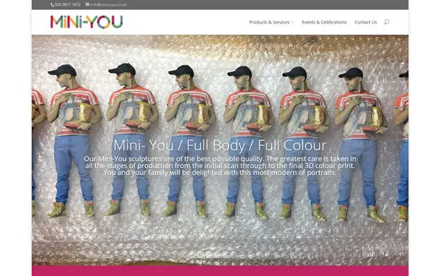
Mini-You is a great business that offers miniature sculptures of individuals made to order. Equally innovative is its very straightforward website.
It uses a boxed layout with white full screen background image, large full width image and a strong dark pink contrast colour. With content areas covering most of what you want to know, this is a solid, no-nonsense website for business.
It’s something you could build yourself by customizing the Divi Jeweler Landing Page template.
Sweet Cecily’s
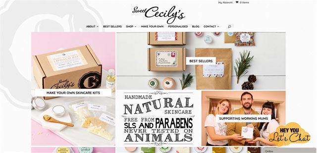
This is a confectionery website that leverages imagery to sell. It’s an attractive website and even though there’s a lot going on, everything is still understandable and visible.
The design is busy but in a good way. There’s lots to see but it is ordered in a grid layout with a textured background. Soft colours, modern fonts and a friendly, approachable feel make this a great example of a small business website.
The Divi Tea Shop Landing Page template could provide the foundations for your own version of this site.
The Design Space
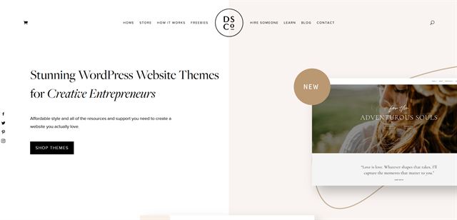
The Design Space is a creative agency, so will want their own website to reflect their skills like others in this list. We think their websites does that and more.
It’s simple but elegant and uses simple colours, plenty of space, some nice fonts and simple navigation to deliver exactly the experience we would want from a creative team like this.
You could use the Divi Cosmetics Shop Landing Page for your own version.
The Chronicles of Ms I-Hua
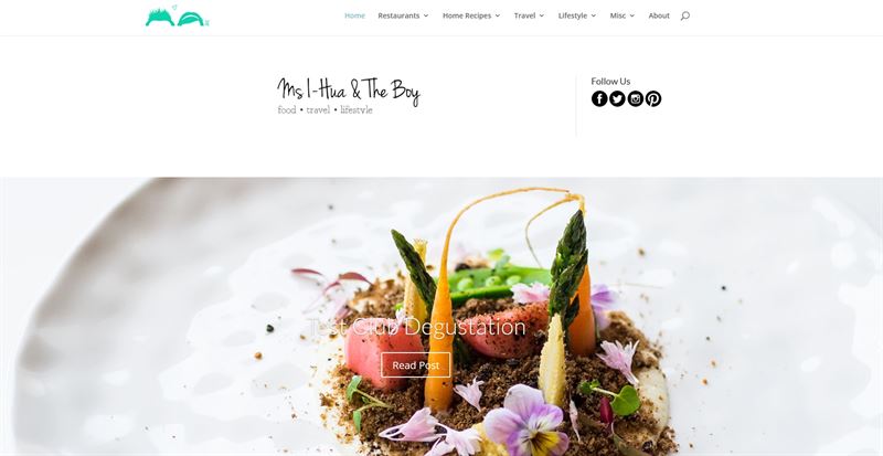
The Chronicles of Ms I-Hua is a food blog. It has a very professional look with crisp images, clear fonts, straightforward navigation and standard grid post layout.
The site is minimalist in a good way, allowing the images to stand out and add colour, drawing your eye to the posts which are at the heart of the site. It’s another great use of Divi!
The Cooking School Landing Page has a similar quality feel to this website.
Blog themes built with Divi
Blogging is still incredibly popular, both in business and for individuals. It’s a powerful method of sparking conversations, having your say, sharing your stories and ideas and promoting yourself or your brand.
All those things are as relevant today as they have always been.
If you’re planning to start your own blog, there is bound to be a Divi theme example here you could use.
Blog Genesis
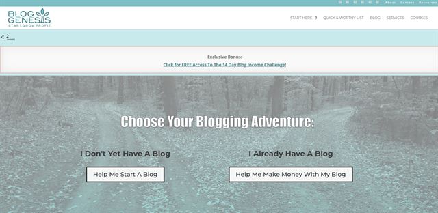
Blog Genesis is a company that sets up blogs and helps you monetize them, so what better way to showcase a blog theme than this?
The theme is light and breezy with light blue and pink colours, modern fonts and relaxed imagery. While not the most innovative design in the world, it conveys everything a visitor would need to know, which is exactly what we need.
The Divi Travel Blog Landing Page template could help you with a similar look.
Ofia Seghaou
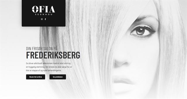
Ofia Seghaou is a salon that just oozes style. Their website is a monochrome design that works really well with stylish background images, strong content and areas of dark and light. Simple coloured images stand out against the simple design which just add to their impact.
The site uses alternating dark and light areas with alternating font colours for clarity. It’s a well balanced design with plenty to look at but also plenty of empty space, and excellent placement to the CTAs to their contact form.
The Divi Makeup Artist Landing Page could help you create something like this.
Haris Cizmic
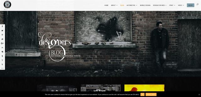
Haris Cizmic is a creative with his own blog to showcase his design projects. While the content is rather intermittent due to work commitments, the style of the design is always present.
It’s a dark and light theme with large hero image and handwritten font header, simple navigation and light on dark elements as you go down the home page. It’s a neat switch from the usual and ideal for a creative.
The Divi Marina Blog Page could help you achieve the same kind of look.
Cat Townsend

Cat Townsend’s blog makes quite a statement with a full screen header image and then bold colour blocks underneath outlining what the blog is about. Below, the page opens into a familiar white background with monochrome images and bold pink contrast colour.
The design of the blog is simple but the hard work is completed by those two upper blocks. By the time you get to the content, you’re primed and ready, which is good design.
You could create something very similar with the Divi Travel Agency Landing Page.
Wego Travel Blog
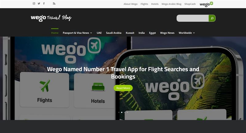
The Wego Travel Blog has a smart modern design with a full width slider and rounded content areas on a dark background. The green contrast colour creates interest while sharing the latest posts.
Dark design can be controversial but the Wego Travel Blog does it very well and it helps create a professional feel without being obvious about it.
The Travel Blog Landing Page would be the easiest way to build a site like this.
WordPress portfolio themes built with Divi
Portfolios are a creative showcase of your work and need to both highlight that work and stand back and let that work shine.
It’s a tough balance to strike but one that can be achieved with the right approach, some creativity and Divi.
Here are a few Divi theme examples of some excellent portfolios built with Divi.
Bamboo Studio
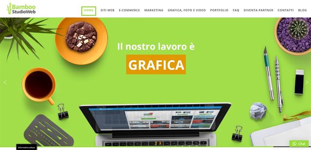
Bamboo Studio is light, bright and very vibrant and isn’t afraid to use effects on its pages. The design is a refreshing mix of light, white and green with modern fonts, strong imagery and an excellent balance of empty space and content.
There is a lot going on here, so those small empty spaces play an important role in balance. Otherwise, simple navigation and other page elements keep you on track.
The Divi Web Agency Landing Page could help you build a similar design if you wanted to.
Philippa James Photography
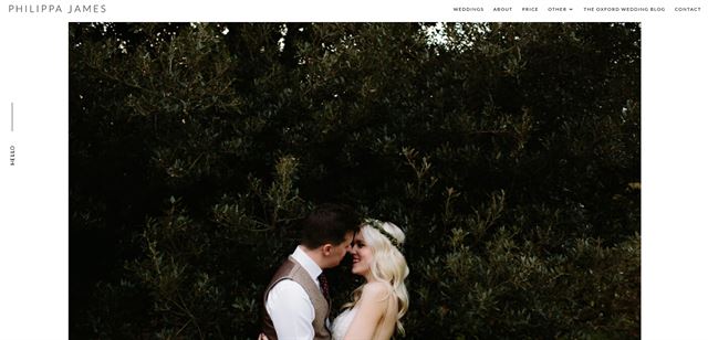
Philippa James Photography is another image-heavy design offset with elements of minimalism and lots of white space. The design is built around those images with understated navigation, modest fonts and small content areas that don’t distract.
It’s a blog-style layout that tells the story as you go down the page and has been artfully put together.
The Divi Wedding Planner Landing Page could create a similar effect with a little work.
Food business themes built with Divi
Food businesses are a large target market of WordPress theme families like Divi. Therefore, this market needs to be strongly represented here.
We have found a range of great food business themes you could recreate with a Divi template.
Here are just a few of them.
LongTable Beer Café
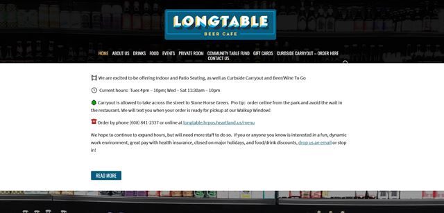
LongTable Beer Café is another refreshingly simple website with characterful images painting the picture and concise copy to reinforce the point. This site has more pages and more going on than Tony Roma’s but has a similar feel.
A simple, no-nonsense layout, a few images to tell the story and insightful copy to seal the deal. What more do you need?
The Divi Food Catering Landing Page layout could help you do the same.
Sushi La Maison
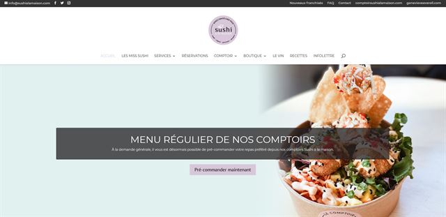
Sushi La Maison is a bright and breezy WordPress theme that uses a larger navigation and top bar with colourful hero image and sliding effects. It’s a nice website with a friendly feel and high quality images of the food.
Down the page, product and service boxes take over with more images underneath. Overall, the feel of the site with the colours and modern fonts creates a nice atmosphere. You could also use some Divi modules to enhance the functionality of your site.
The Divi Restaurant Landing Page is a decent basis for something similar.
The White Lion Inn
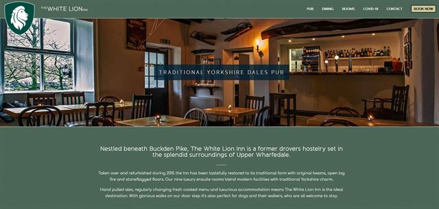
The White Lion Inn uses a sage green colour that reflects the region this pub is based in, the Yorkshire Dales in England. It’s a great example of friendly, approachable design with enclosed slider with images of the food, bar and accommodation and creates a homely feel.
The design is simple, direct and welcoming, just like the Yorkshire people. With attractive pages for dining, rooms and booking, there is everything here you would expect.
The Divi Bed And Breakfast Landing Page could provide a solid foundation for a similar design for your own pub.
Casa Dorita
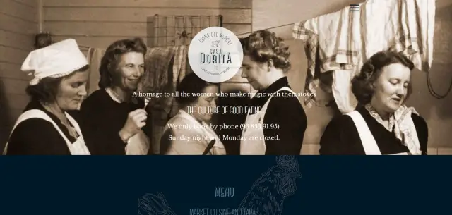
Casa Dorita is a restaurant website with full screen flavour. It opens with a heritage image of nonnas working in the kitchen, which reflects the brand in question. The rest of the home page is also full width with dark and light sections with a mix of standard and handwritten fonts.
While not all the elements work, the overall impression has a family feel of days gone by, which is exactly what the restaurant is aiming for.
The Divi Sushi Restaurant Landing Page could help you create something much like this.
Mendocino Farms
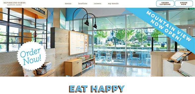
Mendocino Farms is a sandwich store that also offers food bowls and catering services. While the messaging is a little confusing, the overall web design is excellent.
It’s light and breezy, uses good quality images and has lots of white space to help you breathe between page elements. It’s a nice, relaxed design that creates an impact of a business you would want to do business with.
The Divi Farmers Market Landing Page could help recreate something like this.
Mokkabar
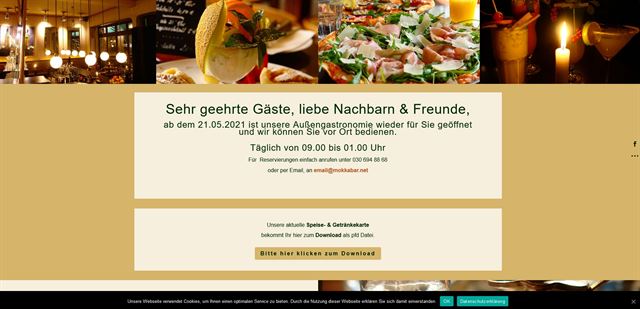
Mokkabar is a full screen coffee bar and restaurant website with niche colours, bold content blocks and atmospheric imagery that helps create the feeling you want to experience were you in there for real.
It’s a deceptively simple design with nice imagery, sans serif fonts, alternating image and content blocks and a selection of complementing colours.
The Divi Bar Landing Page could help you design your own interpretation of this site if you wanted to.
If you want to learn more about installing WordPress themes, check out ‘How to Install a WordPress Theme [Step-By-Step Guide]’.
Once your website has been built, ‘WordPress On Page SEO Checklist: 21 Step-by-Step Guide to Boost Traffic’ is here to help you get more visitors.
IMH
Do you want a fast website?
Who am I kidding? Don't we all?
So why do so many of us struggle?
The biggest challenge is usually finding a fast, reliable hosting company.
We've all been through the nightmares - support take takes forever or doesn't resolve our problem always blaming something on your side...
But the biggest bummer is that the website always feels slow.
At CollectiveRay we host with InMotion hosting and our website is stupid fast. We run on a custom stack of LightSpeed server setup on MariaDB with a PHP7.4 engine and fronted through Cloudflare.
Combined with our front-end optimizations we reliably server 6000 users every single day, with peaks of 50+ simultaneous users.
Want to get a fast setup like ours? Transfer your site for free to InMotion hosting and get our 50% OFF on current pricing.
Try InMotion Hosting with 50% OFF for CollectiveRay visitors in April 2026 ONLY!
Recent Divi updates
Even though Divi has been around for a while, it is continually updated with new features. The most recent Divi theme update brought significant speed improvements.
Page and site builders often come at a cost. Whether you’re building a one page website or a traditional multi-page site, loading can be impaired by the page builder.
They make building pages simple and opens up web design to anyone but they can slow those pages down when loading. This can interrupt the visitor experience and reduce your SEO impact. So even if you have a one page website, your site can still be slow!
Adding a video background or using lots of images just adds to that delay. But a video background is great to have for that visual impact!
The most recent Divi theme update seeks to minimize that speed impact.
The Divi theme has been completely reworked to be much, much faster than before. It now scores 100 on Google PageSpeed Desktop, 99 on Google PageSpeed Mobile and 100% on GTmetrix.
Those are impressive figures!
Elegant Themes membership offers great value for money and Divi Builder is updated regularly to keep improving so there's even more reason to buy!
The Divi theme, Divi Builder and Elegant Themes in general offer a great balance of quality, substance and price. With so many websites build with Divi, we aren’t the only ones to think that.
Do you own websites built with Divi? Did you like this list of the best Divi theme examples? Or are your one who has tried Divi theme builder but are not sure? What did you think? Share your feedback below!

