Minimalists websites help users think more quickly.
In an era when users are now more impatient and tech burnout is becoming more common, designing for calmness and clarity—as little as possible (minimally) —is essential for the success of any online business.
Let’s describe minimalist website design and discuss the advantages it provides to you and your visitors.
We’ll take a look at:
- Minimalist design’s aesthetic markers - check out some minimalist WordPress themes.
- The advantages of minimalism in terms of user interface
- How minimalist design prevents tech burnout in users, and why it’s vital for your business’s success
{autotoc}
1. Visual aesthetics
It’s natural to default to the factors of minimalism that we can see and engage with when we think of minimalism.
Apple’s design aesthetic, for example, is instantly recognizable and a major trendsetter in the tech world. Despite being fairly simple, their design is always pleasing to the eye.
The reason for this is that their visual style is very simple.
Let’s look into what that means, the different factors that go into creating a minimal aesthetic, and why those factors are so impactful.
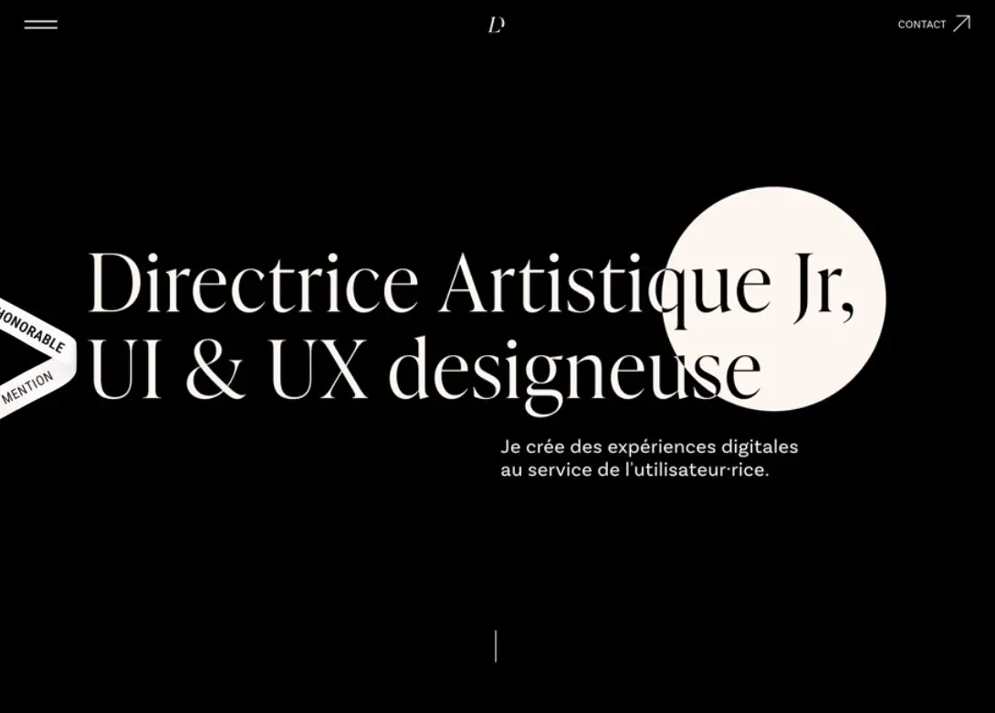
2. Black or white
White’s neutrality is soothing not only to the eyes but to the mind also. Since the color has no meaning, users will not be disturbed or forced to consider what it means.
White backgrounds make important aspects like calls to action and useful text stand out for maximum effect while also ensuring good color contrast. Its brightness is a great tool for accessibility when paired with contrasting colors.
White’s “serious” counterpart is black. It still has a minimalist, content-focused UI, but it has a more “dressed-up” feel to it.
3. Sans-serif Font
Sans-serif letters appear cleaner than serif fonts, which is why they’re frequently used by larger corporations. When we combine sans-serif typography with big font size and/or a bold font weight, we can achieve the greatest impact and emotion, and our words can be the most captivating elements of our websites if we choose them smartly. Less is more in this case.
Check out some minimalist font types here.
4. Colors that stand out
Bold colors stand out against both white and black backgrounds, but when used as background colors, they can look just about as simple as white or black while expressing more emotion and meaning.
Gradients are a great way to use bright colors without burdening the user, especially when used in conjunction with a sans-serif font. Here’s an example from Dribbble that demonstrates how minimalism can take many forms, and how minimalist websites can be of different sizes and shapes.
Emotional, but straightforward.
5. Design with a flat surface
Flat design is a website design trend that began in 2012 and has since gained popularity.
Although it is a visually attractive take on minimalism, NNGroup raised serious usability concerns because flat designs applied minimalist concepts to interactive features like buttons, making them appear as if they were not interactive at all.
This led to “Flat 2.0,” which uses rounded edges and shadows to give these interactive elements more detail without cluttering the user interface.
Curved edges are useful because they resemble the rounded corners of real-life buttons. Shadows make buttons more relatable by adding a 3D aspect to them, differentiating them from the design and evoking real-life elements.
If we don’t make it clear that interactive tap targets are engaging, our design will become unusable because the user has to figure out what is and isn’t clickable. This convoluted reasoning contradicts everything that minimalism purports to achieve.
Although a minimalist graphic aesthetic will make our designs neater, we shouldn’t go overboard when it comes to UI design.
Prioritize clarity and clickability over visual interest.
6. Visual clutter should be avoided
As a general rule, when something is useful, although not to the vast majority of consumers or in the current context of the user, it should be hidden.
Relocating a less-important navigation item into an off-canvas menu, only to be disclosed when actually desired, is an example of trying to hide something to reduce cognitive burden.
The reasoning behind this is that why force the user to consider its meaning when they are unlikely to need to see or use it in the first place?
We must also take into account the fact that if there is too much content, users will be unable to recall important information at times especially.
Our memory is affected by cognitive load. We become paralyzed and unsure of where to go when confronted with too many objects or options. It’s not looking good.
7. Use visual hierarchy
The significance of each element should be indicated visually, and the order in which they are viewed should be influenced.
This means that certain elements will need to be visually prioritized to help the user understand what’s going on. Consider a product whose price is showcased in a text size that is bigger than the product name.
The user may learn that the product costs ten dollars, but they will be perplexed for a few moments because they have no idea what the product is.
It’s even worse if it turns out they don’t care about the product because they’ve already processed information that isn’t even relevant to them.
8. Making fewer choices for a more streamlined experience
Too many options to choose among equals a slower response time, according to Hicks’ law. When a user is presented with too many options, he or she may experience decision paralysis, which is defined as the inability to make a decision as a result of cognitive load.
For example, Nike’s website was created to only show you just a few products at a time.
The website of Atoms is an excellent example of how the number of options has been reduced. Only 4 nav items are included in the main navigation, with the less relevant points being moved to the website footer.
When a user chooses to “Find Your Fit,” they are presented with a conversational, one-by-one approach to selecting the best product.
9. Designing friction that is useful
Functional clutter, like visual clutter, adds to the user’s cognitive load and can be a big distraction, leading to a significant drop in conversions.
In the case of eCommerce, 34 percent of vacant checkouts are due to customers being forced to create a new account, resulting in a massive loss of revenue.
This doesn’t necessarily imply that we’d have to force customer checkout in this situation, but it does imply that we could make creating an account optional.
If we really wanted to reduce the user’s cognitive load, we could ask them to make an account after they check out, so that the idea of creating an account will not be a distraction!
Before going deep into prototyping, creating a flowchart map is a great way to reduce website friction.
That way, if there are any points of friction due to functional clutter, we can reconsider the user’s journey and create a much more pleasant experience.
Preventing your users’ tech burnout
That way, if there are any points of friction due to functional clutter, we can reconsider the user’s journey and create a much more pleasant experience.
10. Preventing tech burnout
We are currently living in the most visual version of our world ever created. There are plenty of applications, websites, and gadgets to keep them contained.
Because of the rapid adoption of new technology, our everyday items, kitchens, and backpacks—are becoming digitally rooted with new technology and features that promise to improve our lives.
However, the truth is that only a select few succeed in the long run.
More technology, more issues.
As flawed humans, we only can handle a little amount of cognitive load, yet everything we accumulate adds to that load. This holds true not only for the goods we have but also for the setup and maintenance they require, as well as the knowledge and information required to operate them.
And this assumes that we actually use the product—have you ever canceled a yearly subscription due to less time or motivation after only a few months?
Social media, on the other hand, is a little different. Many users are addicted to it, with many spending at least two hours per day on it alone.
There are simply not enough hours in the day to use, read, watch, or otherwise consume everything we want, but the real issue is the long-term impacts on our mental wellbeing.
It makes us feel weighed down.
The burden is a combination of stress and responsibility. We’re stressed since we don’t allow ourselves to relax, instead of filling every waking minute with technology.
Obligation because so many products use gamification and lock-in contracts to unethically retain users. Then there’s our obsession with the next greatest thing and bargains.
The temptation to become addicted to technology is all around us.
11. The effects of website users being overburdened
When users are overburdened, they may experience one of two emotions:
Impatient: They’ll only be willing to invest a small deal of time and effort into the website, and they’ll give up it if they encounter even a minor stumbling block.
Frustrated: If a user is overwhelmed by options or choices, they are less likely to convert and are more likely to switch to a competitor or give up their search altogether.
In other words, when users browse the web, there’s a good chance they’ll leave early due to impatience and dwindling attention spans. Unfortunately, for most regular users, this is just normal behavior
12. How can users benefit from minimalist websites design?
We can reduce the cognitive load of our goods as digital designers, which reduces stress, irritation, and frustration.
In an internet age that continuously demands our attention, our websites can be a refreshing change.
The key is to create minimalist websites that don’t add to the user’s already massive cognitive load, so let’s look at how a minimalist approach to website design can optimize website UX. We’ll also look at a few truly inspirational examples of fantastic minimalist websites along the way.
Websites with a minimalist look are about more than just aesthetics. Minimalist design is a method of being as clear as possible while using as little material as possible.
Minimalist Website FAQs
What are some of the most important characteristics of minimalist design?
Simplicity, clean lines, and monochrome color combinations characterize it. Minimalist design usually consists of a very few elements on a page, plenty of blank or negative and a design that focuses on the shape, color, and texture of a few key elements.
What colors are often used in minimalistic designs?
Many designers use simple color palettes when creating minimalist designs. Colors like simple black, white, and/or gray shades are popular. In general, most minimal design palettes cost of a maximum of three color shades.
How do minimalists do decoration?
There are three main approaches minimalists make to deliver their signature look. They remove clutter, use a neutral base palette and remove everything from the page that isn't strictly necessary.