
Since a few years back, when Google announced that mobile-friendliness is a ranking factor, mobile or responsive web design is no longer be an afterthought for small and medium business websites.
Mobile devices today make up a significant proportion of web traffic (53% in 2019).
Businesses that offer a poor experience to mobile users risk losing customers and revenue. There are several ways to provide a good mobile experience, but responsive design is the best choice for SMEs using WordPress.
This kind of design is less expensive, offers a unified experience, and cohesive branding across devices, and it’s better for SEO — mobile-first design is Google’s preferred mobile optimization strategy. (Even their crawlers look at a site from a mobile device).
1. What Is Responsive Design and how does it affect Business WordPress Themes?
If you aren’t already familiar with the concept, here’s a nutshell explanation: it is design that uses CSS media queries and a proportional grid design to alter the way pages appear depending on the size of the device.
For example, elements that span a page horizontally on a desktop browser will be stacked vertically on a smartphone browser. Images and type are resized to reflect the screen size of the device.
At the heart of responsive design are CSS media queries.
CSS style sheets are used to control how a web page looks: the colors it uses, the page’s layout, its typography, and so on. Media queries allow a designer to selectively apply CSS rules only when a certain condition is met. (i.e. if a screen size looks like a mobile screen, apply designs that are appropriate for mobile phones, but if its larger, then apply designs for larger screens…).
Hopefully, you can see how that is useful for creating varying designs for different screen-layouts. Media queries allow a developer to say, for example, if the web browser window has a particular width, a specific set of rules should be applied.
A typical media query looks like this:
.my container {
 width: 800px;
}
@media (max-width: 600px) {
 .my_container {
 width: 500px;
 }
}
In the example above, the default width of the class .my_container is set to 800px.
Obviously, we don’t want it to be this wide on a narrower device, so we use a media query.
The media query here specifies a condition — if the browser’s horizontal width is 600px or less, the width of .my_container should be 500px. If it’s triggered by the condition being true, the rules in the media query take precedence over the “default” rule.
Responsive design for business themes exploits these features of CSS to alter the presentation of web pages depending on the device’s screen size, the size of the browser window, the orientation of the device, and many other factors.
2. Responsive Design Frameworks
Unless you’re already familiar with CSS — and even if you are — you might not relish the idea of writing media queries for every aspect of your responsive business WordPress theme, which is where design frameworks come into play.
A responsive design framework takes care of much of the complexity of creating a site which caters for screens with varying sizes.
The most popular design framework is Bootstrap – with versions from v3.0 onwards being fully mobile-first. Bootstrap includes a huge number of features that don’t concern us here, but key to Bootstrap’s implementation of responsiveness is its grid.
Recommended Reading: How to a Convert PSD to WordPress Theme using Bootstrap in 5 Steps: a tutorial and Elementor vs Divi – which is most worth the money?
Instead of asking you to write your own media queries, Bootstrap implements a system that divides an HTML page into a grid of rows and columns. Rather than writing media queries, users attach classes to their WordPress theme’s HTML to divide the page according to the grid.
To take a trivial example, think of a two-column web page.
On large screens, we want the columns displayed next to each other. On small screens, we want them to stack on top of each other.
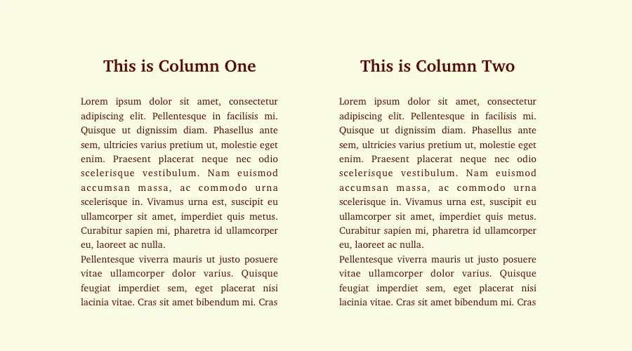
Our HTML would look like this:
This Is Column One
This Is Column Two
With the Bootstrap Grid CSS included on the page, this HTML would create the layout we’re looking for.
When the page is loaded in a window smaller than that specified for Bootstrap’s built-in media queries for medium columns, they’ll stack on top of each other rather than spanning the page.
You can see more complex examples of how this works in the Bootstrap documentation.
Bootstrap is not the only framework that provides a grid of this sort; in fact, there are dozens, ranging from comprehensive web design frameworks like Bootstrap and Foundation, to lightweight grid frameworks like Simple Grid that contain nothing but the grid.
An alternative approach has become increasingly popular over the last years, one which contains all the markup changes to CSS (or SASS) files, rather than littering HTML pages with non-semantic markup.
SASS responsive design grid systems like Susy and Bourbon Neat leverage the power of SASS to create frameworks that keep the page layout code where it’s supposed to be — in the CSS files, allowing for cleaner HTML.
Which developers choose is a matter of taste and experience, but we personally prefer SASS-based grid systems that let me write semantic web pages that aren’t full of non-semantic class names and excessive div nesting.
3. Responsive Design Theme Frameworks
Frameworks like Bootstrap and Foundation are great for web designers, but they don’t do much to help WordPress developers looking for a head start when building new templates.
Fortunately, there are many responsive WordPress theme frameworks that provide a pre-built foundation.
1. Genesis

Genesis is a hugely popular theme framework from StudioPress (which we’ve reviewed fully here). Although it’s aimed more at experienced WordPress developers than newbies, it’s not too difficult to get to grips with if you have a smattering of PHP and CSS knowledge.
Genesis is a parent design from which it’s possible to create any number of child themes. If you’d prefer to buy an off-the-shelf child themes and customize it, StudioPress offer many different child themes suitable for all types of sites.
Besides this theme, we often feature highly-rated WordPress themes so you can make a good decision whether to buy or not.
2. Themify Builder
If you aren’t a PHP and CSS whizz, you might want to consider a template builder plugin like Themify.
Rather than making you roll up your sleeves and dive into the code, Themify Builder offers an intuitive drag-and-drop interface for creating fully responsive WordPress themes. With Themify you can choose from a range of pre-built themes, or design your own from scratch.
Themify abstracts away all of the implementation details that underly web design for different screen sizes, making it easier to get your website up-and-running quickly.
3. Components
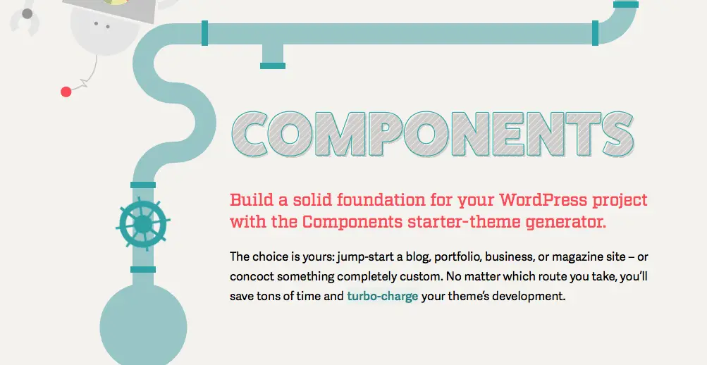
Components was a great solution for creating customizable responsive WordPress themes from Automattic, the company behind WordPress.com.
To use Components, you simply choose a layout from the list — classic blog, business site, portfolio, among others — and the Components site will spit out a SASS-based template with mobile-first layouts and both desktop and mobile menus.
Sadly, Components has been discontinued.
4. Divi
Divi, which we will also mention below as one of the top WordPress themes to use for business, started off as a theme.
Eventually, it evolved to become a theme, a drag and drop page builder and now with its last releases, also a full theme builder. At this point, Divi is a full WordPress theme framework that can be used to create any kind of theme you need, with its wide array of tools.
4. WordPress Responsive Themes for Business
If you’d rather simply buy something ready for your business, you have thousands to choose from, some better than others. Responsiveness is seen as a “must-have” feature on the WordPress theme marketplace, and almost every developer will claim their product is responsive. However, this feature can be tricky and even experienced developers can have trouble with its proper implementation.
Before we go on any further, you might want to check out our full roundup of WordPress Themes for Business and Corporate Sites.
That said, if you choose one of these popular designs, all of which can be customized to meet the needs of your businesses, you won’t go far wrong.
Divi
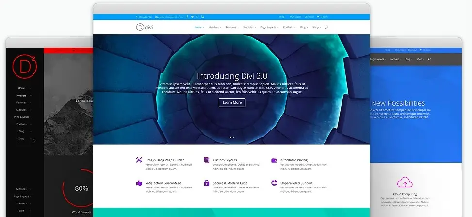
Divi is a hugely popular responsive WordPress theme for business (or anything else really), a page builder (Divi Builder), and also a theme builder.
The product comes from Elegant Themes — an established company that has created many of my favorite WordPress products. Divi is a “batteries-included” theme — it comes with every feature you could possibly want.
Among the highlights are the Divi builder, which lets users build layouts without coding, eighteen pre-made layouts to choose from, and intelligently implemented responsiveness that means your site will look great whether viewed on a desktop PC with a huge monitor or a small-screened smartphone.
Try Divi now and get 10% OFF until January 2023
Recommend Reading: if you’re inclined to use Divi check out CollectiveRay’s full Divi Review.
Avada

Avada is another very popular item.
Avada is a feature-rich as Divi, and is perfectly suited to the building of business sites which can adapt to various screen sizes. Like Divi, Avada empowers users with no coding chops to build unique sites.
The Avada visual page builder (Fusion) is a pleasure to use, and the product contains any number of thoughtful touches that make it an excellent choice for the less technically inclined WordPress site owner.
Recommended Reading: Once again, for major themes, we’ve created an excellent Avada WordPress theme review so you can fully understand how it may help you.
X
X is yet another responsive WordPress theme for business that aims to make it easy to get up and running with a beautiful and unique design that look’s great on any device.
One of the standout features of X is its extension system.
Rather than implementing features within the core of the template, X provides numerous feature extensions, including a grid, TypeKit integration, a slider, and gallery plugins. Splitting functionality into extensions allows users to choose the capabilities they need and avoid loading their site with superfluous code that could lead to performance and security problems.
Other Templates for Business On Themeforest
If the themes we’ve looked at here don’t excite you, don’t worry, there are hundreds of WordPress responsive themes (for all kinds of business, organizations and in all kinds of specific niches) to choose from on Themeforest.
When choosing a product from the selection available on Themeforest, be sure to pay careful attention to the user ratings — they’ll help you sort the wheat from the chaff. You should also take note of how recently the item was updated.
If it hasn’t been updated for several months, you should consider looking elsewhere; out-of-date themes can cause compatibility and security issues.
5. Why Is Responsiveness The Best Choice For Your Business Site?
Responsiveness is not the only way to handle mobile web traffic.
Alternatives include dedicated mobile sites and native apps and PWAs (a hybrid between mobile sites and apps). The problem with each approach is that they require more work than a responsive site.
If your business chooses a mobile app or PWA, then it has to invest in its design, development, maintenance, and promotion. Money and time are split between a website and an app — or several apps to accommodate popular mobile platforms.
This design however, allows SMEs to maintain one codebase and dedicate resources to creating the best website they can. There are circumstances where native apps are the best choice, but for most SMEs, responsiveness is a better use of resources.
Imagine a potential client searches for a service your business offers while using her iPhone. She finds what she wants and bookmarks it for later.
That evening she opens the bookmark on her desktop computer, and the site looks terrible because she bookmarked the mobile version. This scenario isn’t as bad as if the site had no mobile version at all, and she were forced to deal with the unmodified desktop version on her phone — no one likes pinching and panning to find what they want — but a this design would allow the same website and the same links to work as intended on both devices.
Having one site that responds to the user’s device also allows businesses to provide cohesive branding across all points of contact.
The site will look the same, albeit adapted, and it will provide the same navigation, the same look and feel, and the same experience. Small businesses with limited budgets often don’t have the resources to maintain consistent quality across multiple site versions and apps.
Responsiveness means they don’t have to.
Just as users shouldn’t be offered a fragmented experience, it’s better for search traffic if there is one canonical online location for a business. According to Google, the advantages of responsive design include:
-
Keeping your desktop and mobile content on a single URL, which is easier for your users to interact with, share, and link to and for Google’s algorithms to assign the indexing properties to your content.
-
Google can discover your content more efficiently as we wouldn’t need to crawl a page with the different Googlebot user agents to retrieve and index all the content.
Google is able to tell if users have a good experience on your site. If you don’t offer a mobile-friendly site, bounce rates for mobile users will skyrocket. Most of them will bounce back to the search engine. Google knows when a user immediately returns to the SERPs after clicking on a result and uses bounce rates as a ranking signal.
Finally, for WordPress users, responsiveness is the easiest and least expensive method of providing a good experience for mobile users. Many of the best premium themes are designed to be responsive and the cost of adapting an existing theme for responsiveness can be significantly less than the cost of developing a native app.
Given these advantages, for small and medium business owners who use WordPress themes, responsive design is by far the best way forward in a world where mobile web use is only going to grow.

Did you know that people who share useful stuff like this post look AWESOME too? 😉
Please leave a useful comment with your thoughts, then share this on your Facebook group(s) who would find this useful and let’s reap the benefits together. Thank you for sharing and being nice!
Disclosure: This page may contain links to external sites for products which we love and wholeheartedly recommend. If you buy products we suggest, we may earn a referral fee. Such fees do not influence our recommendations and we do not accept payments for positive reviews.
